Line graphs are a powerful tool for visualizing data trends over time. Whether you’re tracking sales, stock prices, or any other data set that changes over time, a line graph can help you identify patterns and make informed decisions.

Fortunately, creating a line graph in Google Sheets is quick and easy, even if you’re not a data expert. Here’s a step-by-step guide to getting you started.
Step 1: Open Google Sheets and Enter Your Data
In order to create a line graph, first we need some numerical data. In the following example, I am going to make a line chart to illustrate the attendance of the total students.
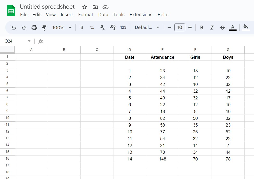
For that, I have created four columns having dates, and total attendance of girls and boys. In the row section, add all the necessary data with a separate cell for each data point. You can also add labels to each variable to make your data easier to understand. Now, let’s turn this data into a line graph.
Step 2: Select Your Data
Next, select the cells containing the data you want to include in your line graph. You can do this by clicking and dragging your mouse over the cells, or by clicking on the first cell and then holding down the Shift key while clicking on the last cell in the range.
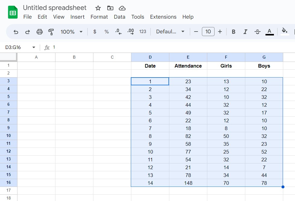
All the selected data will be shown highlighted.
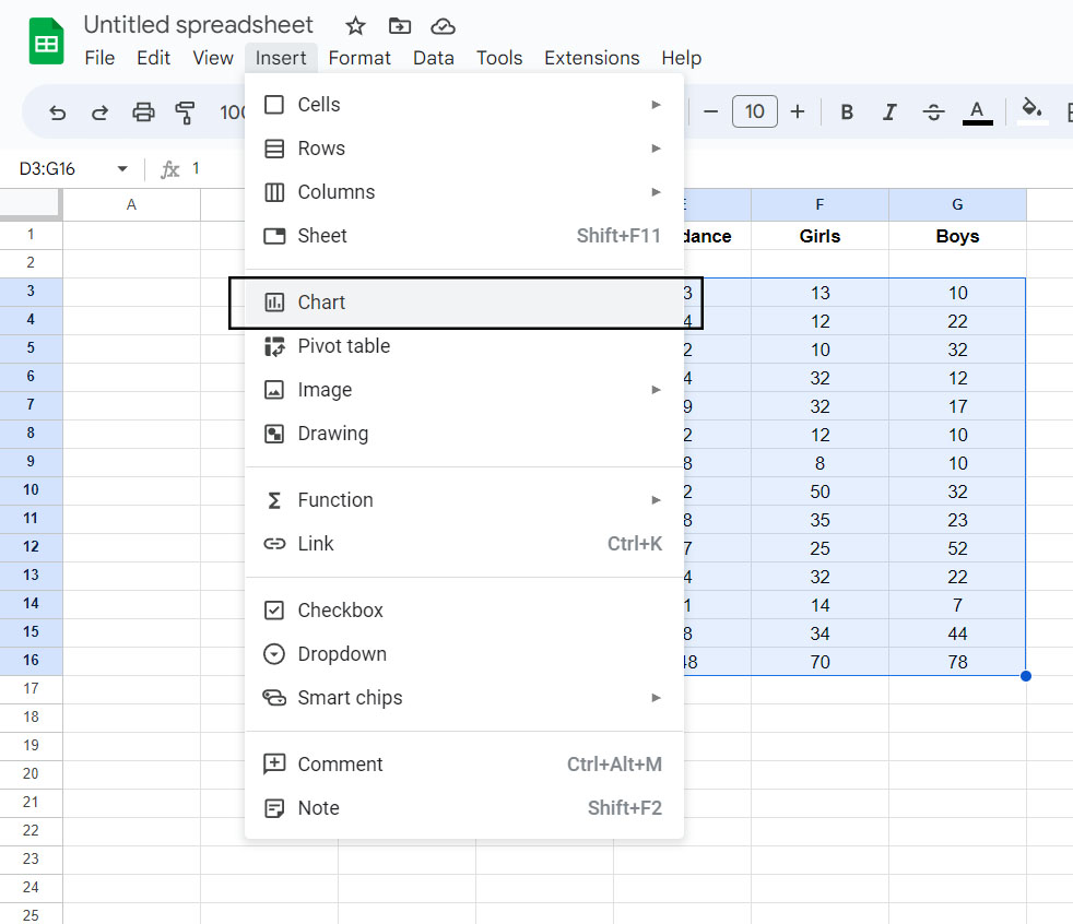
Step 3: Insert Line Chart
With your data selected, click on the “Insert” tab in the top menu bar and choose “Chart” from the drop-down menu. This will bring up a list of different chart types you can choose from, including line graphs.
In the “Chart” window, select “Line chart” from the list of options. You can preview different styles by hovering your mouse over each chart type. Once you have selected the line chart, you will see a graphical representation of your data in a line chart.
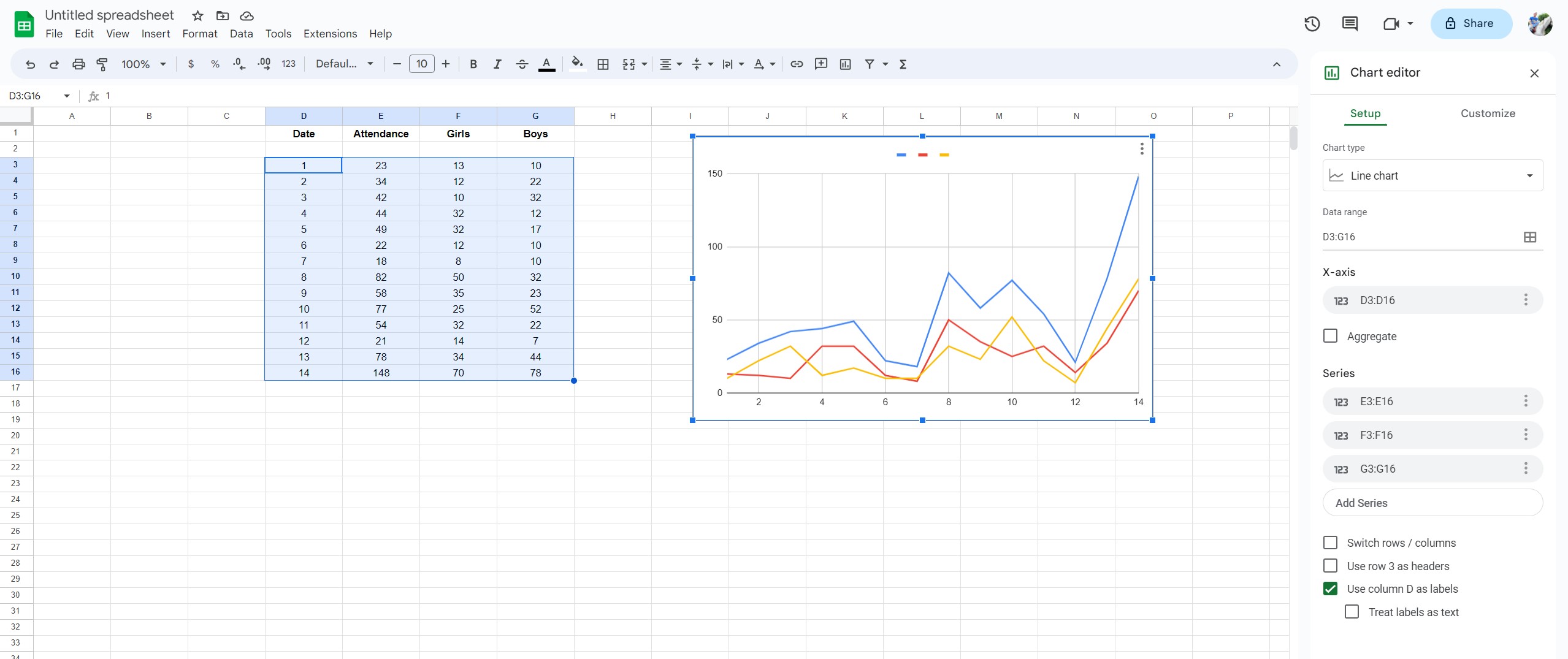
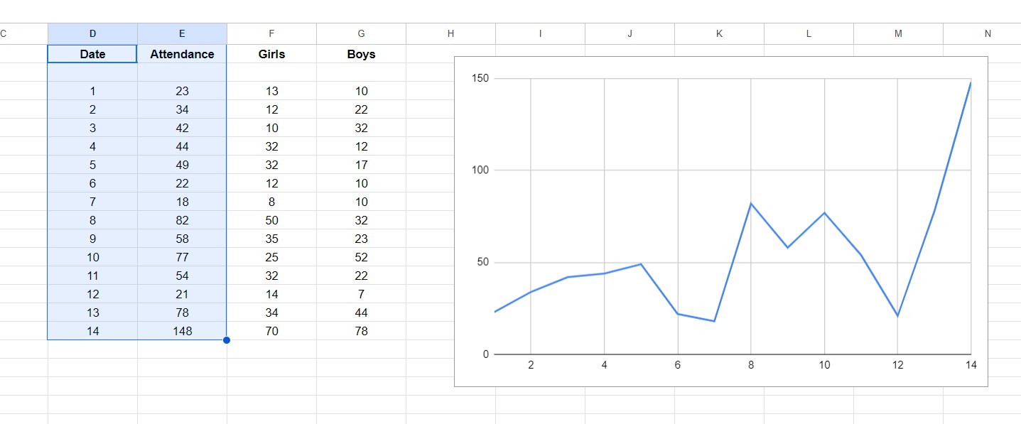
In this chart, I can see the attendance of all the students from day 1 to day 14, including the attendance of individual boys and girls. However, if I only want the graph of the total student attendance each day, I would have only selected the Date and Attendance column cells from the data and not the Girls and Boys column cells. And, this is how it would look.
As you can see, by default, the first column shows the X-axis (horizontal) plane of the graph, and the second column shows the Y-axis (vertical) plane of the graph. With that said, you can always customize this to your taste. So let’s learn more about it.
Step 5: Customize Your Chart
Once you’ve selected your chart type, you can customize your chart in a number of ways. For example, you can choose whether to display labels, change the axis titles, or adjust the colors and styles of the lines in your graph.
To edit any existing chart, click on the “⋮” triple dot you see in the chart and select edit. Now once you have done this, go to the customize section and customize as you like it.
- You can change the chart style
- Make the line graph smoother
- Add chart titles and subtitles
- Show labels and trendlines
- Change spacing between gridlines and ticks
Step 6: Save and Share Your Chart
Finally, once you’ve customized your chart to your liking, you can save it and share it with others. Simply click on the “Save” button in the top right corner of the chart window, and then choose how you want to share your chart, such as by embedding it in a website or sharing it via email.